“Does anyone here know why you should have a vector version of your logo?”
I asked that question as part of my first BNI presentation a few weeks ago. Out of 28 members, only three knew the answer; two were members that I designed logos for, and the third was my mentor who helped me prepare for the presentation. I know that sampling is too small to accurately apply to a larger (internet sized) group, but I would be willing to bet that at least half of the people reading this don’t already know the answer either, and I would like to change that.
For those of you in a hurry, or who really try to avoid math whenever possible, I’ll put the tl;dr answer here first: Vector images can be scaled up (and down, and up again) indefinitely without losing detail – Raster images can’t.
If you would like to know more, aren’t intimidated by math, or aren’t sure what makes one image raster and another one vector, then please keep reading. I should say up front that most of the information I’ll be sharing is based on personal experience gained while working with both raster and vector images over the last decade, and observing their differences first-hand. Some of my math might be shaky at best, so I’m using it for illustrative purposes only. Also, this is going to be a horribly long post. For that I apologize.
What does ‘raster’ mean, oh wordy blog post writer?
I’ll start off my explanation by saying that most of the images you run across on the internet, and all of the images in print, are “raster” and the most common raster file extensions you will find on the internet are .jpg, .png, and .gif.
If you would like to read a detailed explanation of Raster Graphics, you can find one at this Wikipedia link.
At its most basic, raster images are based on a standard X/Y grid that’s filled with pixels, “dots” in the print world, that when viewed from a distance, or at a higher resolution, form a picture. Usually the greater the distance from the image, or the higher the resolution of the screen, the better the picture looks; provided the image isn’t set to fill the high-resolution screen, and instead stays at the size it was built. You gamers know what I’m talking about.
Great! Why does that matter, and what does that mean? This is where the real wordiness begins.
![]() If you zoom in close enough on a raster image, you’ll clearly see square pixels or dots that form it. The resolution at which an image is built determines how smooth or jagged an image will look. The higher the resolution, the smoother it looks. At lower resolutions, the pixels are more obvious to the eye; curves start to look jagged, like stair steps. I’m sure you’ve all noticed that in an image at one point or another.
If you zoom in close enough on a raster image, you’ll clearly see square pixels or dots that form it. The resolution at which an image is built determines how smooth or jagged an image will look. The higher the resolution, the smoother it looks. At lower resolutions, the pixels are more obvious to the eye; curves start to look jagged, like stair steps. I’m sure you’ve all noticed that in an image at one point or another.
![]() [Here comes the math…] Most screens display resolutions between 72 and 130 pixels-per-inch (ppi), so an image that is 1″ x 1″ on a 72ppi screen, takes up 1 square inch of that screen and is 72 pixels wide by 72 pixels high for a total of 5184 pixels making that image. That same image viewed on a 130ppi monitor is still made up of the same pixels, but it will take up less than 1 square inch of the screen.
[Here comes the math…] Most screens display resolutions between 72 and 130 pixels-per-inch (ppi), so an image that is 1″ x 1″ on a 72ppi screen, takes up 1 square inch of that screen and is 72 pixels wide by 72 pixels high for a total of 5184 pixels making that image. That same image viewed on a 130ppi monitor is still made up of the same pixels, but it will take up less than 1 square inch of the screen.
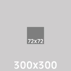 [More (print focused) math] Good quality printing is done between 250-300dpi (dots-per-inch). So that same 72ppi image that was 1″ square on your screen will only take up a bit less than 1/4″ square of space on a page printed at 300dpi. On your screen, the “72×72” image to the right looks like it’s still a good size; in fact, the same size as the image above, just inside a larger light-gray box. The next image below shows roughly how that same graphic would look if it were printed on a page at 300dpi. As you can see, the original image is very small, and basically useless for print.
 Now imagine if that first “72×72” image above was a logo on your website that needed to be printed at high quality for a magazine ad. The tiny, darker gray box in the image to the right is how it would look in that magazine ad at 100% size. Your instinct might be to just have them scale it up to an inch on the page, but that’s the limitation of raster images that I’m about to go into.
Because raster images are made of pixels they’re labeled “resolution dependent” : they’re meant to be used at the size they’re created, or smaller. Higher resolutions lead to larger file sizes because every pixel has to contain a value for its color (RGB for screen, CMYK for print), X/Y position in the image grid and transparency value (also known as Alpha) if the image is a .png or .gif file with transparency enabled. Increasing the resolution, dimensions, or both of an image increases the number of pixels in the image, and that increases the file size. [math alert] If we go back to our earlier example of the 1 inch squared 72ppi RGB image, and let’s assume it’s a .png that’s all black, but set to 25% transparency [just roll with me on that bit], so let’s call it 6 values for each of the 5,184 pixels; or 31,104 total values for that image. For the 300ppi image that would be 540,000 values. As the physical size of a raster image increases, both the file size and the number of pixels increase exponentially.
You might be thinking, “If more pixels = better resolution, then great! Increasing my image size should work fine!” I hope you aren’t thinking that, but I have, over the years, run into a number people that must have thought that way based on what they asked me to do in a print job with images pulled from websites. Here is the reason why that doesn’t work. As powerful as your computer is, it can’t “see” the image that you’re manipulating. When the physical size of an image increases, your computer needs to calculate the values to put in those [Math agin? Seriously?] (based on example, 72×72 increased to 300×300 = ) 81,846 newly created pixels.
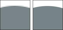
![]() As bad as the results are (at this time), at least it doesn’t throw things in with oblivious abandon. It compares the values of pixels that touch each other, and calculates how the pixels between them should look based on that info. What it can’t tell is if something should be a sharp edge or not, so everything ends up looking blurry. For an example, as you can see in the image to the right, I took the first 72×72 image and scaled it up to 300×300. For the top gray section, since there wasn’t any color variation, it did a good job of determining what the color needed to be. Once it got close to the white characters, it needed to start guessing. Even though the only two colors in the original image appeared to be white and gray, some pixels ended up being somewhere between the two, and some ended up being darker than the gray. These variations were introduced by a process in the original image called “antialiasing” which I won’t even begin to go into, other than to say it helps jagged things look smoother than they really are.
As bad as the results are (at this time), at least it doesn’t throw things in with oblivious abandon. It compares the values of pixels that touch each other, and calculates how the pixels between them should look based on that info. What it can’t tell is if something should be a sharp edge or not, so everything ends up looking blurry. For an example, as you can see in the image to the right, I took the first 72×72 image and scaled it up to 300×300. For the top gray section, since there wasn’t any color variation, it did a good job of determining what the color needed to be. Once it got close to the white characters, it needed to start guessing. Even though the only two colors in the original image appeared to be white and gray, some pixels ended up being somewhere between the two, and some ended up being darker than the gray. These variations were introduced by a process in the original image called “antialiasing” which I won’t even begin to go into, other than to say it helps jagged things look smoother than they really are.
 One final thing you should know about raster files [Yes! The end of my talking about raster is near!]; if you size an image down, let’s say it’s your company logo and you are shrinking it to fit in the header space for your website, your computer calculates which pixels in the image to throw away. Now lets say you were in a hurry, not thinking, whatever, so you save the newly resized image over your original file. Later, if you decide you want your company logo back at the original size for a print job, and you don’t have the original image backed up somewhere else, you are out of luck. It’s time to talk to whoever created the original file, hope someone else in the company has a copy of the original file, or find someone with the skills to rebuild it.
After all of that, I’m almost afraid to ask: what about vector?
I’m glad you asked, hypothetical blog post reader! If you hadn’t this would have been a very ineffective comparison of raster to vector. The great news is that this shouldn’t be quite as long as my description of raster.
Vector images, in my experience, typically tend to be used only for graphics like icons & logos, and right now they aren’t used much (as themselves) on the internet. However since the latest browsers support the .svg format (Scalable Vector Graphics), which as you can probably tell by the name is vector based, that may be changing. Our current version of our website swaps out the header logo .jpg with an .svg version when it’s viewed on a modern browser, like on an iPad equipped with a retina screen, so it will stay sharp even when it’s zoomed in. Fonts on the internet also behave like vectors for the same reasons that I will go into shortly; provided they haven’t been turned into a raster image.
Here is what Wikipedia has to say about vector graphics.
Where raster images use pixel/dots, vector images use points, curves and lines that all have a mathematical relationship to each other, and the space they inhabit. They can fit together to form shapes that have color and Alpha values, as well as possible strokes of varying thickness.
Each point can either have one or two handles coming off of it that direct a line between points on how to be shaped. These handles and points form what are called Bezier Curves. If a point has no handles, it’s considered a corner point.
Since a picture is worth a thousand words, and I’m getting tired of typing, in the image below I created a circle shape in vector to show what I mean by points, curves and handles.
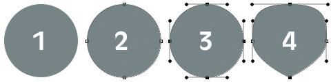
- the shape as it appears with nothing selected.
- shows that the shape is made of four points with curved lines between them.
- I selected all of the points to show what the handles look like. The distance and angle between a point at the end of a handle and its originating point determines the shape/curve of the line that leaves that point, and the handle of the point the line goes into determines how looks entering that next point. Lines in a vector image can only exist between two or more points.
- I altered the handles on the top-most point to change the shape of the curve, and I deleted the handles from the bottom-most point, turning it into a corner point.
Now let’s contrast that same circle between raster and vector: take a look at the values needed to make it and also how it looks zoomed in.
[Math; but so close to done] The raster version of the circle is 107 pixels by 107 pixels = 11,449 pixels total. Assuming the six values per pixel, that’s 68,694 values that make up that circle. As you know from before, enlarge it and that number gets bigger and the image gets fuzzy because the computer has to make stuff up.
The vector of the circle, currently (although, as you will see, it doesn’t matter) is also 107 pixels by 107 pixels… BUT! It is made up of four points, with handles, has a solid (=Alpha) color and lines between the points. That is all the info that matters. So, 4 points (X,Y locations) = 8 values, there are 8 handle points (each point with an X/Y value) = 16 values, the shape has a color value (RGB) = 3 values, and an Alpha value (100%) = 1 value. That means the entire shape is created with only 28 values. 28 values is much, much less than 68,694 values. So that saves on file size, but big whoop. How does it help with enlarging the image?
 Since these points and their handles exist mathematically, if you were to increase it to 100x its current size, all the computer has to do is look at each point and multiply their positional values by 100. That’s it. The curves remain the same, the colors remain the same, the Alpha remains the same, and no new points are created, but the image gets 100 times bigger and stays sharp.
This same way of working also allows you to scale a vector image down (division instead of multiplication) and nothing gets thrown away. You can save over your original file, and then later scale it back up without issues. In fact, I’ve found that opening a large vector file in illustrator, scaling it down (ensuring that scale strokes is enabled) and then saving it can actually save on file size; provided the file size isn’t due to a placed raster image inside of the vector image. We get that a lot from manufacturer logos. Some of them are essentially vector shells for a huge high-resolution raster image, and not true vectors at all. They annoy me.
Vector files can also get very, very complicated, and the more points there are in a vector file, the larger the file size will be. That’s why when building vector files, it’s a good idea to keep your number of points as low as you can. Still, even if your vector file uses hundreds of thousands of points, and the file size is a couple hundred megabytes, it will always have the advantage over raster of being able to be scaled up indefinitely and stay sharp, as long as it’s a purely vector file and doesn’t make use of placed raster images.
So, that was shorter than the raster explanation, right? Maybe? A bit.
Now that I’ve buried you with technical details, provided I don’t confuse you and you stuck with it rather than close the tab all annoyed at me for my babble-fingers, it should be obvious why you would want your business logo, the image that is used to represent your company to your customers, to be available in a vector format. That said, there are some logos out there that would be very difficult, if not outright impossible (for me at least), to convert into a vector image. For them, I can only hope they had the foresight to get a version of their logo at a very high-resolution, or else they could have problems down the road.